

Creating an inclusive slide deck isn’t just about aesthetics—it ensures every audience member, regardless of ability, can engage with your content. In this guide, we’ll walk through best practices for building PowerPoint presentations that meet accessibility standards and deliver an exceptional user experience.
Why Accessibility Matters
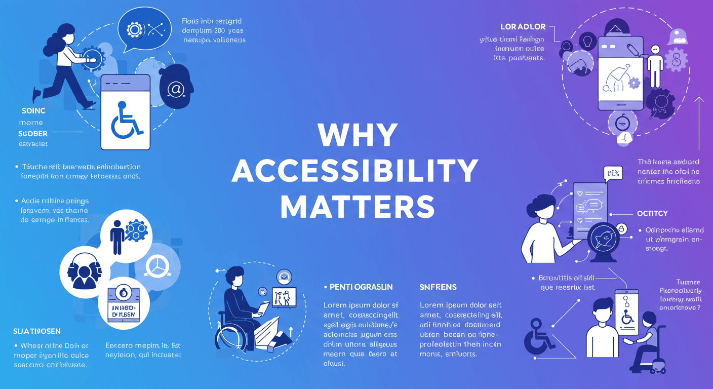
Accessibility in presentations means making content perceivable, operable, understandable, and robust for people with visual, auditory, motor, or cognitive impairments. Beyond ethical and legal considerations, accessible slides help everyone—such as attendees in a bright room or people using mobile devices—to consume information more effectively. Read more Mastering Slide Design.
Choose Readable Fonts
Select sans-serif fonts like Arial, Calibri, or Verdana for maximum legibility. Use font sizes of at least 24 pt for headings and 18 pt for body text. Avoid decorative or condensed typefaces that can be difficult to decipher, especially at a distance or on small screens.
Ensure High Contrast
Color contrast is crucial for readability. Aim for a ratio of at least 4.5:1 between text and background. Use online contrast checkers to validate your palette. Dark text on a light background or vice versa works best. Avoid red / green combinations, which can be challenging for color-blind individuals.
Add Alt Text to Images
Every non-decorative image or graphic should include descriptive alt text. In PowerPoint, right-click the image, choose “Edit Alt Text,” and write a concise description. This helps screen-reader users understand visual content and context within your slides.
Structure Content with Slide Headings
Use built-in PowerPoint slide layouts and styles to define headings (H1, H2, H3). Proper heading structure provides a logical reading order and makes navigation easier for assistive technology users. Avoid placing headings inside text boxes without applying the slide title placeholder.
Simplify Slide Layouts
Keep each slide focused on one main idea. Limit bullet points to five items. Use ample white space to reduce cognitive load. Group related elements and avoid overloading slides with text or graphics. A clean design enhances comprehension for everyone.
Provide Captions and Transcripts for Videos
![]()
If your presentation includes embedded videos, ensure captions are enabled or overlay your own. Provide a text transcript in speaker notes or as a handout. Captions aid attendees who are deaf or hard of hearing and reinforce learning for all viewers.
Design Accessible Data Tables
When presenting data in tables, include clear column and row headers. In PowerPoint, use the Table Tools > Design tab to mark header rows. Keep tables simple and avoid merged cells, which can confuse screen readers.
Use Descriptive Links
Instead of “click here,” hyperlink descriptive text like “Download the project roadmap.” This practice provides context for screen-reader users and improves SEO by signaling link purpose to crawlers.
Test with Accessibility Tools
PowerPoint’s built-in Accessibility Checker flags issues such as missing alt text, low contrast, or unreadable tables. Run the checker under Review > Check Accessibility. Additionally, test with a screen reader (e.g., NVDA or VoiceOver) to verify reading order and element labels.
Conclusion
By implementing these steps, you’ll create PowerPoint presentations that are not only visually appealing but also truly inclusive. Accessibility enriches the experience for all attendees and demonstrates your commitment to clear, responsible communication.
Frequently Asked Questions
Q1: What is the minimum font size for accessible slides?
Aim for at least 24 pt for headings and 18 pt for body text to ensure readability across devices and audiences.
Q2: How do I check if my color contrast is sufficient?
Use online tools like the WebAIM Contrast Checker to measure the contrast ratio between text and background. A minimum ratio of 4.5:1 is recommended for normal text.
Q3: Can I automate alt-text generation in PowerPoint?
PowerPoint offers autogenerated alt text for images, but it’s often vague. Always review and customize alt text to accurately describe the image for your specific context.
Q4: Are decorative images required to have alt text?
No. Mark purely decorative images as “decorative” in the Alt Text pane so screen readers skip them and focus on meaningful content.
Start applying these techniques today, and you’ll be on your way to delivering presentations that stand out for both clarity and inclusivity.


