

Color is more than a visual accessory—it drives emotion, guides attention, and reinforces your core message. In presentation & slide design, understanding color psychology empowers you to craft slides that resonate, persuade, and leave a lasting impression. Whether you’re pitching to investors, educating an audience, or sharing research, selecting the right colors can make or break your slide deck.
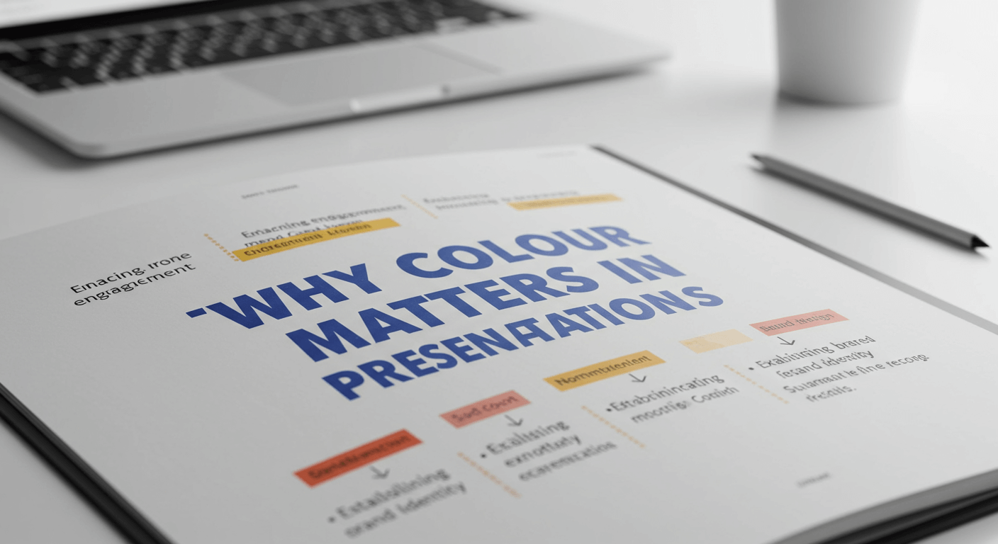
Why Colour Matters in Presentations
Humans perceive color before reading text or absorbing data. Our brains process color cues rapidly, triggering emotional and cognitive responses. When used thoughtfully, color can:
- Establish Hierarchy: Accent colors highlight key points, guiding viewers through your narrative.
- Enhance Memorability: Striking color contrast ensures slides stick in memory longer.
- Reinforce Branding: Consistent brand hues build trust and recognition.
- Influence Mood: Warm or cool palettes evoke energy, calmness, or urgency.
Neglecting color strategy can lead to bland, confusing, or visually overwhelming slides. By mastering color psychology, you harness the power to make every slide purposeful and impactful.
Understanding Core Color Meanings
While cultural nuances exist, many color associations are universally recognized. Here are six primary hues and their psychological impacts:
- Red: Conveys energy, passion, and urgency. Ideal for calls to action or highlighting critical data points.
- Blue: Symbolizes trust, stability, and calm. Widely used in corporate decks and healthcare presentations.
- Green: Represents growth, balance, and sustainability. Perfect for environmental topics or financial reports.
- Yellow: Evokes optimism, creativity, and warmth. Best for drawing attention but use sparingly to avoid visual strain.
- Purple: Suggests luxury, innovation, and imagination. Great for creative pitches or high-end branding.
- Gray/Neutral: Offers balance, professionalism, and readability. Serves as a versatile backdrop for bolder accent colors.
Steps to Build an Effective Color Palette
- Define Your Objective: Determine the goal of your presentation. Are you persuading stakeholders, educating students, or showcasing design work? Align color choices with the desired emotional response.
- Start with Brand or Theme Colors: Incorporate primary brand colors to maintain consistency. If no brand palette exists, choose one dominant hue that reflects your topic or mood.
- Select Complementary Accents: Use color theory tools (like Adobe Color or Coolors) to find complementary, analogous, or triadic color schemes that harmonize with your base hue.
- Establish Neutrals for Balance: Integrate shades of gray, off-white, or muted tones to give the eyes rest and ensure text remains legible against vibrant backgrounds.
- Test Contrast and Accessibility: Verify color contrast ratios using accessibility checkers to ensure readability for color-impaired audiences. Aim for a minimum AA standard (4.5:1 for text).
Following these steps guarantees a balanced, visually appealing palette that reinforces your message rather than distracts from it.
Applying Colors to Slide Elements
Once you have a palette, apply it strategically across slide components:
- Backgrounds: Use neutral or muted tones for most slides. Reserve bright or dark backgrounds for section headers or key takeaways to create visual breaks.
- Text and Headlines: Ensure text contrasts sharply with the background. Dark text on a light background or vice versa is most effective. Use accent colors sparingly for subheadings or highlighted keywords.
- Charts and Graphs: Assign distinct colors to data series. Limit the palette to 3–5 hues to avoid confusion. Apply your primary accent color to the most important data point for emphasis.
- Icons and Illustrations: Color-code icons to match your palette. This reinforces visual harmony and aids information grouping without overloading slides.
Best Practices and Accessibility

Colorful slides are engaging—but only if accessible. Keep these guidelines in mind:
- Check for Color Blindness: Avoid color combinations like red/green or blue/purple that can be indistinguishable to color-blind viewers. Use patterns or labels to differentiate data when necessary.
- Maintain Consistency: Stick to your chosen palette throughout the deck. Inconsistent use of colors can confuse your audience and dilute your branding.
- Use White Space: Balance colorful elements with ample white (or neutral) space. This prevents slides from feeling cluttered and helps key points stand out.
- Limit Accent Usage: Reserve your boldest colors for critical highlights. Overusing vibrant colors reduces their impact and can overwhelm viewers.
Case Studies: Real-World Examples
- Tech Startup Pitch: A fintech startup used a navy blue background with bright orange accents. The blue established credibility, while the orange call-to-action buttons drove investor focus to funding requests.
- Non-Profit Presentation: An environmental NGO combined deep green with soft yellow highlights. This palette reinforced the sustainability theme and maintained a warm, hopeful tone throughout their fundraising pitch.
- Sales Deck for Consumer Goods: A retail brand selected a neutral gray background, pairing it with vibrant teal and coral accents. The muted backdrop kept product images front-and-center, while the accents guided viewers to pricing and features.
Conclusion and Next Steps
Mastering color psychology transforms your slides from ordinary to extraordinary. By understanding the emotional impact of hues, building thoughtful palettes, and applying colors strategically, you’ll create presentations that captivate, persuade, and inform. Start by auditing your current slide deck: identify where color enhances or detracts from your message, then iterate using the principles outlined above. With intentional color choices, every slide becomes a powerful visual story.
Ready to elevate your presentation design? Experiment with new color palettes today and watch your audience engagement soar.


