

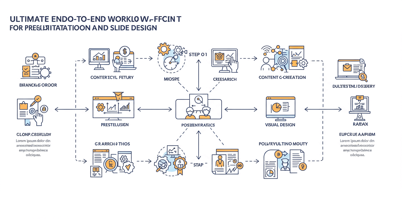
In today’s fast-paced business environment, a powerful presentation can make all the difference between winning hearts and missing the mark. However, without a clear, repeatable process, crafting a compelling slide deck can be time-consuming, inconsistent, and stressful.
Define Your Goals and Audience
Every great presentation starts with a purpose. Before you open your design software, ask yourself:
- What is the primary objective? Are you informing, persuading, training, or inspiring?
- Who is my audience? What is their level of expertise, and what do they expect to gain?
- What is the key takeaway? Distill your message into a single sentence or question.
Documenting these answers upfront guides your content strategy and design decisions, ensuring every slide serves your core objective. Read more Designing Accessible PowerPoint Presentations.
Gather and Organize Content
With goals in hand, begin collecting all necessary materials: data points, images, quotes, and supporting research. Effective content organization sets the stage for smooth design work later. Follow these steps:
- Create a central repository. Use a shared folder or cloud drive labeled by topic.
- Segment assets. Group text, charts, and visuals into subfolders for easy retrieval.
- Annotate sources. Keep track of data origins and copyright info for images.
A well-organized vault of content will reduce the time you spend hunting for files and keep your workflow frictionless.
Craft the Narrative and Slide Structure
A compelling story arc keeps your audience hooked. Map out your presentation structure before designing a single slide. Use the following framework:
- Opening hook. Pose a question, tell a brief anecdote, or share a startling fact to grab attention.
- Context and challenge. Explain why the topic matters and outline the problem you’re addressing.
- Core content. Present your main arguments, data, or solutions in logically ordered sections.
- Call to action. Conclude with key takeaways and actionable next steps for your audience.
Sketch a rough outline or use index cards to sequence your points. Having a clear narrative flow prevents slide overload and keeps viewers focused.
Build a Wireframe and Style Guide
Before pixel-perfect design, create low-fidelity wireframes to nail down layouts and information hierarchy. Then, establish your visual standards:
- Color palette. Choose 2–4 primary colors consistent with your brand or topic.
- Typography. Select heading and body fonts that are legible on screen and in print.
- Iconography and imagery. Define the style of icons, illustrations, and photos to maintain unity.
- Spacing and grids. Set margin, padding, and alignment rules to keep slides uncluttered.
Document this guide in a single reference slide or PDF. It becomes a north star that speeds up design and ensures every team member stays on brand.
Design Visual Elements and Slide Templates
Now that you have a wireframe and style guide, it’s time to create reusable templates and key visuals:
- Master slides. Build a set of master layouts for title slides, content slides, image-focused slides, and closing slides.
- Custom graphics. Craft charts, icons, and diagrams in a vector tool for consistency and scalability.
- Smart use of whitespace. Ensure each element has room to breathe—avoid crowding slides with too much text or imagery.
Having a library of polished, brand-aligned templates accelerates slide creation and guarantees a cohesive visual experience.
Optimize for Accessibility and Consistency
Inclusivity and clarity are non-negotiable. Make sure your slides work for everyone by checking:
- Contrast ratios. Use dark text on light backgrounds or vice versa to meet accessibility standards.
- Font sizes. Headings should be at least 30px, body text no smaller than 18px on projected screens.
- Alt text. Provide descriptive captions for images and charts for screen readers.
- Consistent branding. Double-check logos, color codes, and font styles across all slides.
Accessibility isn’t just ethical—it widens your reach. A consistent visual system reinforces credibility and brand recognition.
Refine with Feedback and Iteration
No slide deck is perfect on the first draft. Incorporate structured feedback loops to elevate your presentation:
- Peer review. Share with colleagues to catch typos, unclear points, and design inconsistencies.
- Audience testing. If possible, present to a small test group to gauge comprehension and pacing.
- Version control. Label drafts clearly (e.g., v1, v2) and archive older versions to avoid confusion.
Iterating based on real feedback ensures your message lands as intended and your design remains polished.
Final Polish and Rehearsal
In the home stretch, focus on presentation delivery as much as design:
- Speaker notes. Add concise cues and timings in the notes pane to guide your flow.
- Animation and transitions. Use subtle, consistent effects. Avoid gimmicks that distract from your message.
- Practice runs. Rehearse aloud with a timer. Familiarize yourself with slide order and talking points.
- Backup plan. Export to PDF and have a second copy accessible in case of technical hiccups.
Confidence in delivery comes from preparation. A smooth transition between your narrative and visuals elevates audience engagement.
Conclusion
By following this structured end-to-end workflow—defining goals, organizing content, crafting narrative, building style guides, designing templates, optimizing for accessibility, iterating with feedback, and rehearsing—you’ll consistently produce presentations that captivate and inform. Integrate these steps into your project routine, and watch your slide decks evolve from static bullet points into dynamic storytelling tools. Start your next presentation with this roadmap, and deliver with clarity, confidence, and impact.


