

In today’s fast-paced digital world, audiences crave more than just bullet points and data dumps. They seek a narrative that resonates, visuals that guide their focus, and slides that leave a lasting impression. By weaving compelling storytelling techniques with strong visual hierarchy principles, you can transform ordinary slides into captivating experiences.
Define Your Narrative Arc
Every great presentation begins with a story. Before opening your slide software, sketch out a clear beginning, middle, and end. The beginning should present the problem or question that hooks your audience. The middle dives into insights, data, or solutions, building tension and anticipation. Finally, the end delivers a memorable conclusion or call to action. Structuring your content this way guides listeners through a logical journey, making complex information easier to digest.
Adopt an Audience-Centric Approach

Understanding who youre speaking to is critical. Conduct a quick audience analysis: What are their pain points? What level of expertise do they have? Tailor your narrative and visual style accordingly. Use language, examples, and references that resonate with their background. When slides reflect the audience’s needs, you build trust and maintain engagement throughout the presentation.
Establish a Clear Visual Hierarchy
Visual hierarchy directs the viewer’s eye to the most important elements first. Achieve this by varying font sizes, weights, and colors. Headlines should be bold and prominent, subheadings slightly smaller, and body text legible but unobtrusive. Use contrast—light text on dark backgrounds or vice versa—to make key points stand out. White space is equally important: ample margins around text and images help avoid clutter and improve readability.
Utilize Consistent Visual Language
Consistency breeds professionalism. Choose a color palette of three to five complementary hues and stick with it across all slides. Select two to three fonts—one for headings, one for body copy, and an optional accent font—and maintain uniform spacing and alignment. Incorporate your brand’s logo, color scheme, and typography guidelines if applicable. A cohesive look reinforces credibility and keeps the focus on your content rather than distracting design shifts.
Leverage Data Storytelling
Data becomes more persuasive when placed into context. Instead of dumping raw tables or charts, craft a narrative around your key statistics. Highlight one or two crucial numbers per slide and annotate them with concise takeaways. Use simple chart types—bar, line, or pie—and avoid unnecessary gridlines or labels. Call out trends with arrows or contrasting colors, and always link data back to your central story. This approach ensures that numbers support your message rather than overwhelm it.
Incorporate Multimedia Elements
Images, icons, and videos can elevate slide impact dramatically. Choose high-resolution photographs that evoke the right mood or emotion. Opt for flat or minimal icons to illustrate concepts without adding visual noise. If using video clips, keep them short (10–20 seconds) and ensure they autoplay seamlessly without disrupting flow. Altogether, multimedia enriches storytelling by appealing to visual and auditory senses simultaneously.
Introduce Seamless Transitions and Animations
Subtle motion can guide attention and reveal information progressively. Use simple fade, wipe, or appear animations to introduce bullet points one at a time, preventing cognitive overload. Maintain consistency in transition styles across slides, and avoid gratuitous effects like 3D flips or bounces that can feel amateurish. The goal is to enhance clarity, not distract from it.
Apply Color Psychology and Branding
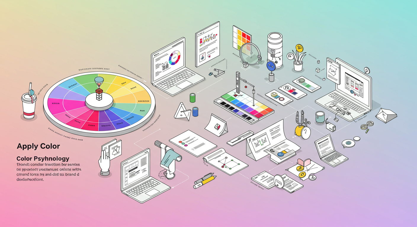
Colors evoke emotions. Warm tones like reds and oranges generate excitement and urgency, while blues and greens convey trust and calm. Align your palette with your brand identity or presentation topic. For example, a health-related deck might favor refreshing greens, whereas a finance report could lean on authoritative dark blues. Use accent colors sparingly to highlight calls to action or critical facts, ensuring they pop against the primary palette.
Test, Refine, and Iterate
No slide deck is perfect on the first draft. Run through your presentation in front of a colleague or record yourself rehearsing. Note areas where transitions feel sluggish, text appears cramped, or the narrative loses momentum. Solicit feedback on both content and design. Then refine: tighten copy, adjust visuals, and streamline your flow. Iteration ensures that your final deck delivers maximum impact every time.
Conclusion
Combining storytelling with thoughtful visual design transforms presentations from mundane to memorable. By defining a clear narrative arc, prioritizing audience needs, and applying principles of visual hierarchy, you can craft slides that inform, persuade, and delight. Embrace these eight strategies—data storytelling, consistent branding, multimedia integration, and more—to elevate your next deck and captivate your audience from start to finish.
Ready to put these techniques into practice? Start drafting your story today, experiment with layouts and colors, and watch your presentation & slide design skills soar.


