

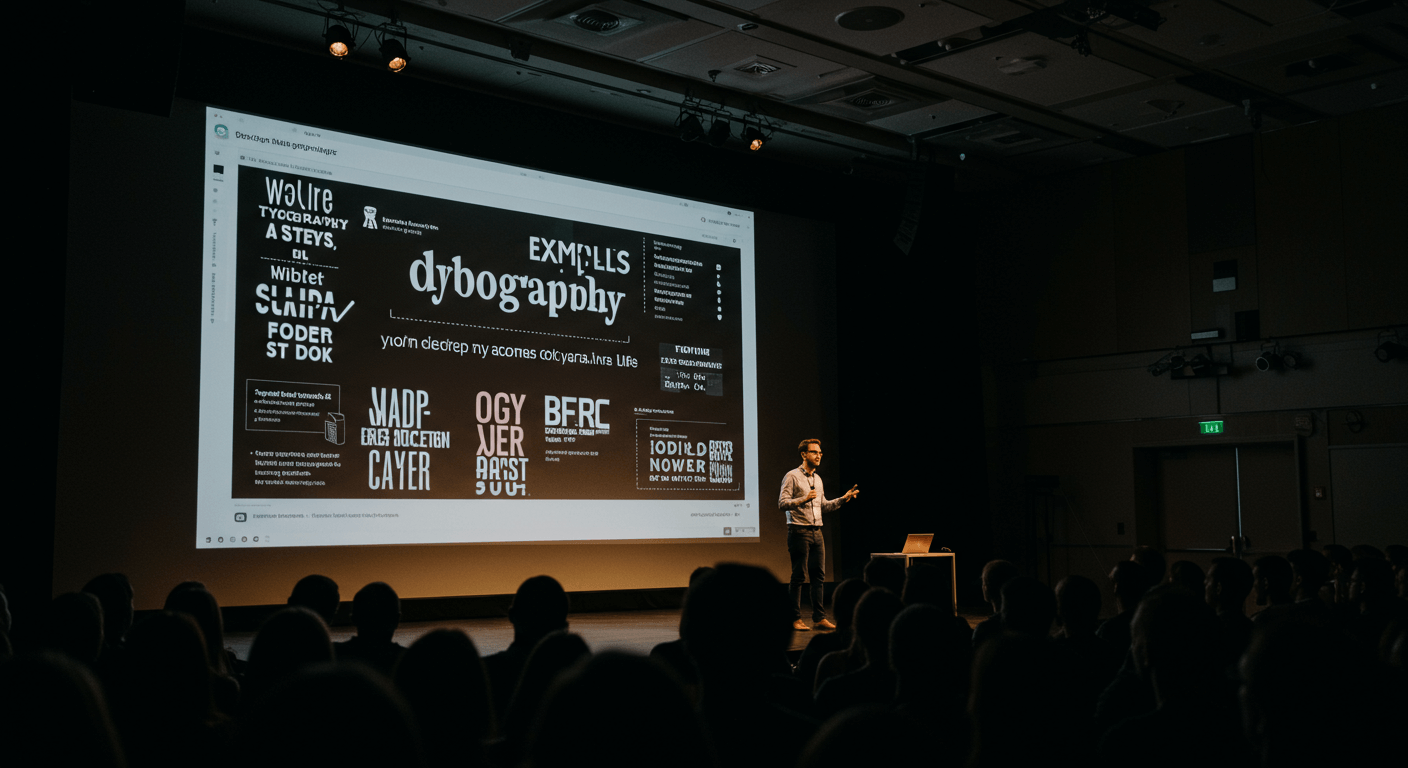
Great presentations rely not only on compelling content but also on how that content is delivered visually. Among all design elements, typography often remains overlooked, yet it plays a pivotal role in setting tone, enhancing readability, and guiding audience focus..
Understanding Typography in Presentations
Typography is more than choosing a pretty font. It encompasses typeface classification, spacing, weight, and alignment—each choice contributes to clarity and emotional impact. In presentations, you have limited time to capture attention. Effective typography ensures your message is legible at a glance and resonates with your audience’s expectations. A well-chosen typeface can convey professionalism, creativity, or innovation, while poor typography can undermine credibility and distract viewers from your content. Learn more about Mastering Storytelling in Presentation & Slide Design
Choosing the Right Typeface
When selecting typefaces for presentations, start by understanding the three main categories:
- Serif: Characterized by small strokes at the ends of letters. Serifs connote tradition and authority. They work well for slides with long-form text or formal topics but can feel outdated if overused in creative contexts.
- Sans-Serif: Clean and modern, these typefaces lack decorative strokes, offering excellent on-screen legibility. Popular choices include Helvetica, Arial, and Open Sans. Sans-serifs are versatile and pair easily with other styles.
- Display and Script: Decorative fonts designed for headlines and accents. Use sparingly to highlight quotes or section titles. Avoid using scripts for body text, as they can impair readability at smaller sizes.
Consider the tone of your presentation. A tech startup pitch might benefit from a sleek sans-serif, while an educational lecture could leverage a classic serif to enhance trust. Always test your chosen font on-screen to confirm legibility from a distance.
Principles of Font Pairing
Pairing fonts effectively creates visual contrast and maintains harmony. Follow these guiding principles when combining typefaces:
- Contrast: Pair a serif with a sans-serif to establish a clear difference between headings and body text. Contrast can also come from weight (light vs. bold) or style (condensed vs. extended).
- Complementary Mood: Ensure both typefaces share a similar personality. A quirky rounded display font may clash with a rigid, technical serif. Match moods—professional with professional, playful with playful.
- Limit Your Palette: Use no more than two to three typefaces per presentation. Too many fonts create visual chaos and undermine consistency.
- Hierarchy Through Scale and Weight: Assign one font to headlines and another to body text. Within a single typeface family, leverage different weights and styles to create subheadings, captions, and emphasis without introducing additional fonts.
Popular pairings include:
- Montserrat (Sans-Serif) with Merriweather (Serif)
- Lato (Sans-Serif) with Playfair Display (Serif)
- Roboto (Sans-Serif) with Roboto Slab (Serif)
Using Typography to Create Hierarchy
Hierarchy directs viewers’ eyes to the most important information in sequence. Achieve clear hierarchy by:
- Size: Headings should be noticeably larger than subheadings, which in turn exceed body text size by 2–4 points.
- Weight: Bold or semi-bold weights draw emphasis. Reserve them for key messages or calls to action.
- Color Contrast: Use a darker or more saturated color for headings against a neutral body text hue. Ensure sufficient contrast ratio for readability.
- Whitespace: Surround headings with extra spacing to separate them visually from paragraphs. Whitespace enhances scannability.
Color, Spacing, and Readability
Typography doesn’t exist in isolation. The interplay of color, line spacing, and letter spacing elevates or hinders readability:
- Line Height: Set line spacing between 1.2–1.5x the font size for body text. This prevents lines from crowding and helps readers track text.
- Letter Spacing: Slight tracking adjustments (–0.5 to +2) can improve legibility for all-caps headlines or bold display text.
- Color Choices: Stick to your brand palette or high-contrast neutrals. Avoid low-contrast text on busy backgrounds. If you overlay text on an image, apply a semi-transparent dark overlay behind the text to maintain contrast.
Accessibility and Legibility Considerations
Inclusive slide design ensures everyone in your audience can access your content. When it comes to typography:
- Font Size: Use at least 24pt for body text and 32–40pt for headings, depending on screen size and viewing distance.
- Contrast Ratio: Comply with WCAG AA standards: minimum 4.5:1 for normal text and 3:1 for large text.
- Avoid Decorative Fonts for Core Content: Decorative or handwritten fonts may look stylish but can be hard to read for viewers with visual impairments.
- Test with Assistive Tools: Use screen magnifiers or checker tools to verify readability before finalizing your slides.
Tools and Resources for Typography in Slides
Leverage these tools to streamline your typography workflow:
- Google Fonts: A free library of web-safe, high-quality typefaces. Use the pairing recommendations to jump-start your design.
- Adobe Fonts: Access a vast collection of premium fonts included with Adobe Creative Cloud subscriptions.
- FontPair.co: Explore curated font pairings and preview text samples live in your browser.
- Contrast Checker Apps: Verify color and text contrast ratios to stay WCAG-compliant.
- Presentation Software Plugins: Tools like SlideModel or PowerPoint add-ins that help you apply consistent typography styles across your deck.
Case Studies and Examples
Let’s look at two real-world scenarios where typography transformed slide impact:
- Startup Pitch Deck: By pairing Montserrat Bold for headlines with Open Sans Regular for body text, a fintech startup achieved modern clarity. Consistent use of 36pt/28pt hierarchy and high-contrast navy text on a white background drove investor focus to key metrics.
- Academic Lecture Slides: A university professor switched from Times New Roman to Georgia for body text and Lato for titles, increasing legibility on large lecture hall screens. Adjusting line height to 1.4x improved students’ note-taking speed by 20%.
Conclusion
Typography is a powerful yet underutilized tool in presentation design. By choosing appropriate typefaces, pairing fonts thoughtfully, and applying hierarchy, color, and spacing best practices, you can elevate the clarity and professionalism of your slides. Prioritize accessibility to ensure all audience members can engage with your message. With the right typography strategy, your next presentation will not only inform but also captivate and inspire.


