

In today’s fast-paced professional environment, the ability to communicate ideas visually is more crucial than ever. A well-crafted visual hierarchy guides viewers through content seamlessly, directing attention to key messages and supporting details. By leveraging principles such as size, contrast, alignment, and whitespace, designers can structure slides that not only look polished but also enhance comprehension. In today’s digital landscape, presentations serve as vehicles for executive pitches, team briefings, academic findings, and more, making clarity a top priority. This year, organizations and individuals strive to stand out amid information overload by refining slide layouts that captivate audiences and reinforce core messages. Understanding visual hierarchy is the first step toward building slides that resonate. By implementing a deliberate order of elements, you offer an intuitive path for the eyes, reducing cognitive strain and reinforcing the narrative flow. Throughout this comprehensive guide, you will explore foundational concepts, practical techniques, and real-world examples that demonstrate how visual hierarchy transforms a collection of slides into a cohesive storytelling experience. Whether you are a seasoned designer or new to presentation creation, mastering these strategies will empower you to craft slides that inform, persuade, and inspire. In the sections ahead, you will learn how to select fonts and colors that reinforce priority, employ whitespace to enhance readability, and use layout grids to maintain consistency. By the end of this article, you will have a toolkit of proven strategies to optimize your slide designs for maximum impact and retention.
What Is Visual Hierarchy and Why Does It Matter
Visual hierarchy is the structured arrangement of elements in a slide or layout in order of importance. In essence, it determines the sequence in which viewers process information. By prioritizing key components, designers establish a visual roadmap that leads the eye from primary headlines down to supporting details. This practice is grounded in cognitive psychology, where researchers have demonstrated that structured layouts reduce mental effort and improve recall. According to research from the Nielsen Norman Group, clear visual hierarchy enhances user engagement by up to 47% when compared with cluttered or poorly organized displays.
At its core, visual hierarchy relies on five fundamental attributes: size, weight, color, position, and whitespace. Larger elements naturally draw focus first, while bold weights or contrasting hues emphasize significance. Position on the slide, such as placing a headline in the top-left quadrant, leverages natural reading patterns. Meanwhile, whitespace prevents elements from competing for attention, allowing the most important items to stand out. Together, these attributes craft a viewing experience that feels intuitive and balanced.
In today’s presentations, your audience often has limited attention spans and competing digital distractions. Implementing a strong visual hierarchy ensures that the most critical insights are not overlooked. Whether you are unveiling quarterly results to stakeholders, teaching a classroom of learners, or pitching new ideas, a deliberate structure helps reinforce your narrative and boosts audience retention. By guiding eyes systematically through your slides, you minimize the risk of misunderstanding and maximize the impact of your message.
Moreover, a well-considered visual hierarchy contributes to a consistent brand identity. Repetitive use of specific styles and layouts builds recognition over time. When every slide follows the same hierarchy rules, your presentation feels unified, professional, and trustworthy. Today’s viewers expect that level of polish and will unconsciously associate clear visual storytelling with attention to detail and credibility. As you explore further, remember that putting hierarchy at the forefront of your slide design process will elevate the overall quality and efficacy of your communication.
Key Principles of Effective Visual Hierarchy

Contrast
Contrast is the degree of difference between elements on a slide and is one of the most powerful tools for establishing hierarchy. By varying font sizes, weights, and colors, you can immediately differentiate primary messages from secondary details. For example, a bold, large headline can anchor the slide while lighter, smaller text provides additional context. Color contrast also plays a vital role: pairing dark text on a light background or vice versa enhances legibility. However, balance is key—excessive contrast can lead to visual fatigue, so use this technique strategically to highlight the most critical points without overwhelming the viewer.
Alignment
Alignment refers to how elements line up along invisible axes or gridlines. Consistent alignment fosters visual stability and creates an orderly appearance. Whether you choose centered text for headlines or left alignment for body content, sticking to a grid system ensures predictability and coherence across all slides. Proper alignment not only makes your slides easier to scan but also signals professionalism, as viewers perceive well-aligned layouts as more credible and organized.
Repetition
Repetition involves reusing visual elements—such as fonts, colors, shapes, or icons—throughout your presentation. This principle strengthens narrative consistency and brand recognition. When audiences see repeated patterns, they intuitively understand the structure and flow of your content. Repetition also reduces cognitive load, as viewers do not need to relearn design nuances on each slide. Instead, they can focus entirely on the message, confident that the layout will support rather than distract from the information.
Proximity
Proximity groups related items together and separates unrelated elements to clarify relationships. By placing text, images, or charts that belong to the same topic close to one another, you create logical clusters that the brain can process more easily. Conversely, leaving adequate space around different clusters prevents visual clutter. Consistent use of proximity not only enhances readability but also reinforces your argument by showing which pieces of information are connected.
Utilizing Whitespace and Layout Techniques
Whitespace—sometimes referred to as negative space—is the empty area surrounding design elements. Far from being wasted, whitespace is a critical component of effective visual hierarchy. It provides breathing room for the eyes, directs focus to important content, and prevents slides from feeling overcrowded. By consciously applying generous margins and inter-element spacing, you create a balanced environment where key messages can thrive.
Grids and layout guides are invaluable tools for managing whitespace effectively. Most presentation software, including PowerPoint and Google Slides, offers gridlines and ruler functions that help you place text blocks, images, and charts with precision. A simple 3×3 grid can serve as an invisible framework: position headings in the top row, visuals or supporting charts in the middle, and footnotes or data sources in the bottom. This structured approach ensures consistency across all slides and builds a predictable flow that keeps your audience oriented.
Minimalism is another vital aspect of leveraging whitespace. By removing non-essential decorative elements, such as ornamental borders or background patterns, you let your core content stand out. In today’s digital landscape, minimalistic designs resonate with audiences because they reduce distraction and emphasize clarity. Aim to communicate one main idea per slide and allow each element enough space to make an impact.
For complex information, consider progressive disclosure techniques. Reveal bullet points or graphic elements sequentially, using animations to introduce each piece in order. This method harnesses whitespace effectively by keeping the slide visually simple at any given moment and guiding the viewer’s attention step by step. By limiting what appears on-screen, you prevent cognitive overload and enhance message retention.
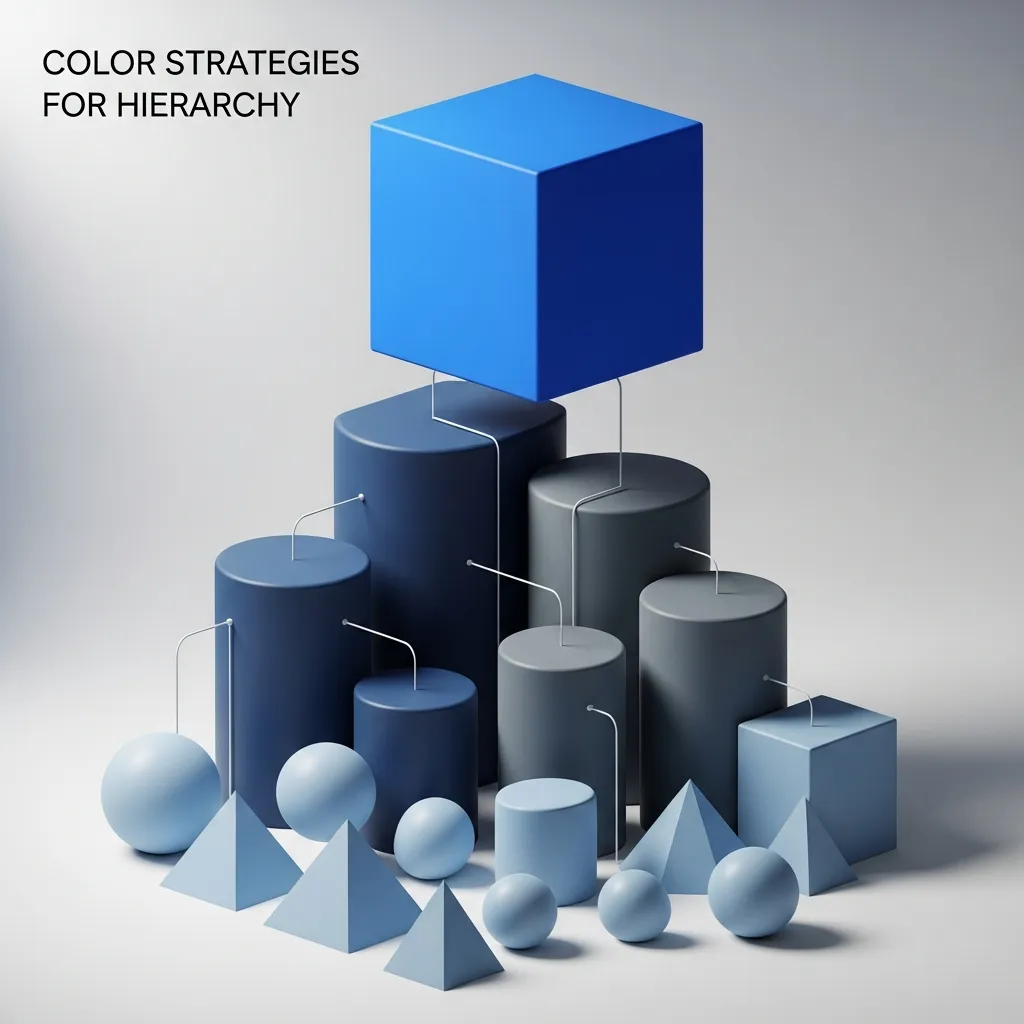
Typography and Color Strategies for Hierarchy
Typography choices directly affect how viewers perceive the importance of textual content. Start with two complementary fonts: one for headlines and a secondary option for body text. Headlines might range from 32 to 44 points, clearly signaling their priority, while subheadings can occupy 24 to 28 points, and body text can stay within 18 to 20 points. Consistent line spacing (leading)—for instance, 1.2 to 1.5 times the font size—ensures readability, and judicious letter spacing (tracking) refines the overall visual texture of your text.
Color palettes further reinforce hierarchy by drawing attention to specific elements. Select a primary color from your brand guidelines for major headings and a neutral or muted tone for secondary information. Bright accent colors should be reserved for calls to action, data highlights, or critical icons. Always verify that text and background have sufficient contrast to meet accessibility standards, such as those outlined by the W3C. Ensuring legibility for all audience members is not only inclusive but also enhances the credibility of your presentation.
Another consideration is the emotional impact of color. Warm tones like reds and oranges can evoke urgency or excitement, while cooler blues and greens often feel calming and trustworthy. Align your color choices with the tone of your message. For example, a financial results presentation may benefit from a stable blue palette, whereas a product launch could leverage more vibrant hues to convey enthusiasm.
Finally, use style variations such as italics, underlines, or uppercase lettering sparingly. Overusing these styles can dilute their impact. Reserve bold or uppercase treatment for the most pivotal phrases or calls to action. By combining typography and color within a structured framework, you solidify your visual hierarchy and guide your audience effortlessly through your content.
Tools, Resources, and Best Practices

This year, a variety of tools and frameworks can support your efforts to implement a strong visual hierarchy. Core presentation platforms like Microsoft PowerPoint and Google Slides remain popular and include built-in gridlines, alignment guides, and master slide features to enforce consistency. For more advanced control, design software such as Adobe Illustrator or Affinity Designer offers precision layout options and custom artboards, enabling you to craft complex slide templates from scratch.
Online design services like Canva and Visme provide user-friendly interfaces and pre-built templates optimized for hierarchy. Their drag-and-drop functionality allows non-designers to quickly assemble slides that follow best practices for contrast, alignment, and whitespace. Additionally, open design systems such as Google’s Material Design and the Bootstrap grid offer free resources and guidelines that can inspire consistent structuring across all visual materials.
For deeper learning, authoritative courses and articles from reputable institutions can help you refine your skills. Explore the MIT OpenCourseWare archives for design and cognition modules or consult articles from the Pew Research Center on information processing and visual perception. Continuous testing and iteration are also crucial: share draft slides with colleagues, gather feedback, and observe how viewers interact with your layouts in live settings. Small adjustments to spacing, font sizes, or color emphasis can significantly boost clarity and engagement.
Finally, keep accessibility top of mind. Use color contrast checkers, test screen-reader compatibility for any embedded text, and ensure that charts include descriptive labels. By integrating accessibility standards—such as those from the W3C—into your design process, you not only reach a broader audience but also reinforce the integrity of your visual hierarchy. In this environment, investing time into well-structured slide layouts pays dividends in retention, persuasion, and professional credibility.
Conclusion
Mastering visual hierarchy is essential for creating presentations that resonate with modern audiences. By strategically arranging elements based on importance—leveraging contrast, alignment, repetition, proximity, and whitespace—you can craft slides that guide attention, simplify complex information, and reinforce your core narrative. Thoughtful typography and color selection further strengthen the hierarchy, while the use of grids and layout tools ensures consistency across your deck. In today’s digital landscape, clarity is a competitive advantage: audiences appreciate designs that respect their time and mental bandwidth. Through continual testing, iteration, and adherence to accessibility standards, you build presentations that not only inform but also inspire action. By applying the principles and practices outlined in this guide, you will elevate your slides from mere information carriers to powerful storytelling instruments. Embrace these techniques in your next project and witness how a well-defined visual hierarchy transforms the way your message is received and remembered.
FAQ
What is visual hierarchy for slide layouts?
Visual hierarchy for slide layouts is the arrangement of elements in a way that guides the audience’s attention. It uses size, color, contrast, and positioning to highlight the most important information first.
Why is visual hierarchy important in slide design?
It helps viewers quickly understand key messages without confusion. A strong visual hierarchy makes presentations clearer, more engaging, and easier to follow.
How does visual hierarchy improve slide layouts?
It organizes content so the most important points stand out first. This improves readability and keeps the audience focused throughout the presentation.
What are the main elements of visual hierarchy for slide layouts?
Key elements include font size, color contrast, spacing, alignment, and positioning. These work together to guide the viewer’s eye smoothly across the slide.
How does font size affect visual hierarchy in slide layouts?
Larger fonts draw immediate attention to key points, while smaller fonts provide supporting details. This creates a clear flow of information.
How does color impact visual hierarchy for slide layouts?
Bold or contrasting colors highlight important elements and separate sections. It helps guide attention and improves visual clarity in slides.
What role does spacing play in visual hierarchy?
Proper spacing prevents clutter and improves readability. It also helps separate important elements from less important details effectively.
How can alignment improve slide design hierarchy?
Consistent alignment creates order and structure in slides. It makes content easier to scan and improves overall visual balance.
What mistakes should be avoided in visual hierarchy for slide layouts?
Avoid overcrowding slides, using too many fonts, and inconsistent formatting. These mistakes confuse the audience and weaken the message.
How can beginners learn visual hierarchy for slide layouts?
Beginners can practice using templates, studying good designs, and applying basic rules like contrast, alignment, and spacing consistently.


