

When designing a presentation, your layout acts as the structural foundation for your content. Slide layouts in PowerPoint contain formatting, positioning, and placeholder boxes for all the content that appears on a slide. Placeholders are the dotted-line containers on layouts that hold text, charts, tables, SmartArt graphics, movies, sounds, pictures, and clip art.
By utilizing these blueprints, you establish a cohesive rhythm. Rather than dragging and dropping elements aimlessly, you leverage scientifically proven visual hierarchies. Whether you are building an investor pitch deck or a classroom lecture, layouts ensure consistency.
The Role of Slide Master View
To truly control your presentation’s aesthetic, you must understand the Slide Master. The Slide Master is the top slide that controls all information about the theme, layout, background, color, fonts, and positioning of all slides. Modifying the master instantly updates your entire deck, saving hours of manual adjustments and ensuring your brand identity remains perfectly uniform.
Essential Benefits of Using Pre-Defined Layouts

Why shouldn’t you just start with a blank slide every time? Relying on standardized slide layouts in PowerPoint offers several massive advantages for professionals and educators alike.
1. Unmatched Visual Consistency
Consistency is the hallmark of professionalism. Layouts lock your fonts, colors, and margins into place. When your audience is not distracted by jumping text boxes or shifting logos, they focus entirely on your core message.
2. Time-Saving Efficiency
When facing a tight deadline, you do not have time to obsess over aligning text boxes. Layouts provide a plug-and-play framework. You simply click, type, insert media, and move forward.
3. Improved Cognitive Load for Audiences
Well-structured slides guide the viewer’s eye naturally from top to bottom, left to right. This reduces cognitive overload, ensuring your audience processes data efficiently. According to presentation experts at Garr Reynolds’ Presentation Zen, simplifying visual design drastically improves audience retention.
The 9 Standard slide layouts in PowerPoint
Every new presentation comes equipped with built-in layout templates. Understanding when and how to use each one will elevate your deck’s visual appeal.
Title Slide
This is the opening handshake of your presentation. It typically features a large text placeholder for the main title and a smaller one for a subtitle or presenter name. Keep it clean and impactful.
Title and Content
The most frequently used layout. It features a header at the top and a large, versatile placeholder below for bullet points, charts, or images. Use this for standard informational delivery.
Section Header
When transitioning between major topics, the section header acts as a visual palate cleanser. It signals to the audience that a new concept is beginning, perfect for organizing long corporate presentations.
Two Content
Ideal for side-by-side comparisons. You can place text on the left and a supporting graphic on the right. This balances the visual weight of the slide and prevents text-heavy clutter.
Comparison
Similar to the “Two Content” layout, but it includes small heading placeholders above the two bottom boxes. This is exceptional for pros-and-cons lists or A/B testing results.
Title Only
Sometimes your visual speaks for itself. The Title Only layout provides a neat header while leaving the rest of the canvas completely blank for a large diagram, full-bleed photograph, or complex data visualization.
Blank
No placeholders. No rules. The blank canvas is best used when you want a full-screen image or when building custom graphic sequences from scratch.
Content with Caption
This layout dedicates a large area to a graphic or chart, with a smaller sidebar for explanatory text. It is a fantastic choice for explaining complex charts where the visual requires context.
Picture with Caption
Tailor-made for photography. It houses a perfectly formatted picture placeholder alongside a brief text box, ensuring your high-resolution images are displayed beautifully without overshadowing the context.
Structured Comparison: Standard vs. Custom Layouts
Deciding whether to use built-in slide layouts in PowerPoint or build your own depends on your project’s scope. Here is a quick comparison.
|
Feature |
Standard Layouts |
Custom Layouts |
|---|---|---|
|
Setup Time |
Instant (Zero minutes) |
Moderate (15-60 minutes) |
|
Brand Alignment |
Low (Generic themes) |
High (Strict adherence to brand guidelines) |
|
Flexibility |
Moderate |
Unlimited |
|
Best For |
Internal meetings, quick updates |
Pitch decks, keynote speeches, webinars |
|
Technical Skill |
Beginner |
Intermediate to Advanced |
Pro Tips for Designing Engaging Layouts
To elevate your slides from good to great, integrate these expert insights into your workflow.
- Implement the Rule of Thirds: Divide your slide into a 3×3 grid. Place your most important elements along the intersecting lines. This creates tension, energy, and interest.
- Leverage White Space: Do not fear empty space. White space (or negative space) gives your text room to breathe and helps the audience’s eyes rest.
- Use High-Quality Assets: Ditch the outdated clip art. Utilize high-resolution images from credible sources like Unsplash or professional vector icons to maintain a modern aesthetic.
- Limit Text: Aim for no more than six words per line and six lines per slide. If you have more to say, put it in the speaker notes or split the content across multiple slides.
Common Mistakes to Avoid When Choosing Layouts
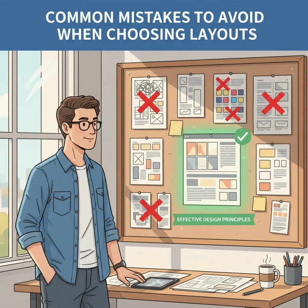
Even experienced professionals fall into design traps. Avoid these frequent pitfalls to maintain authority and clarity.
Overcrowding the Canvas
Stuffing a single slide with three charts, four bullet points, and a logo is a guaranteed way to lose your audience. If your slide looks like a busy textbook page, split the layout.
Ignoring Contrast
Using light gray text on a white background, or placing text directly over a busy photo without a semi-transparent overlay, destroys readability. Ensure high contrast so the people in the back of the room can read your content easily. You can check color contrast guidelines via the Web Content Accessibility Guidelines (WCAG).
Inconsistent Font Usage
Bouncing between five different fonts makes your presentation look disjointed. Stick to two fonts maximum—one for headers and one for body text.
Breaking the Master Layout
Manually overriding placeholders on every slide instead of adjusting the Slide Master leads to messy formatting. Always fix systemic design issues at the master level to ensure your slide deck design remains flawless.
Building Your Own Custom Layouts
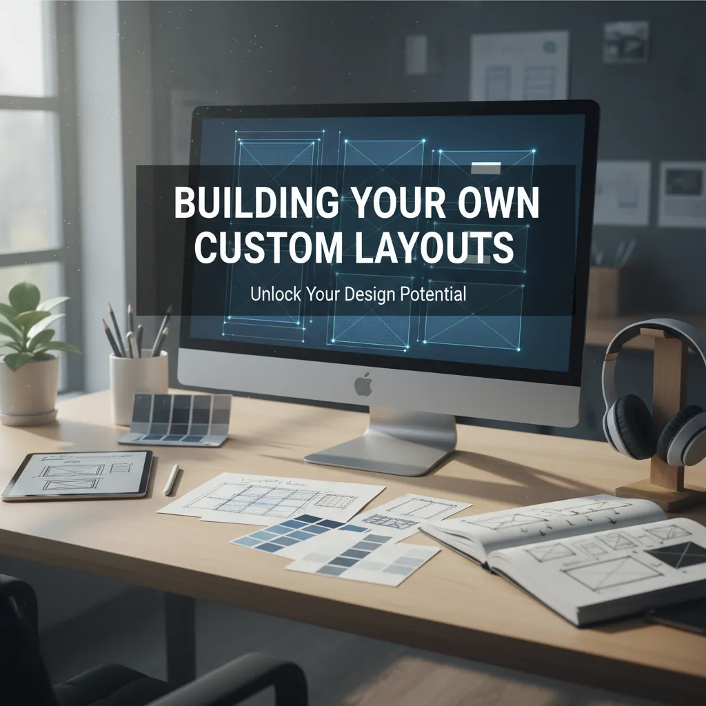
Once you master the basics, creating your own slide layouts in PowerPoint sets you apart as a power user.
- Navigate to the View tab and click Slide Master.
- Click Insert Layout to generate a fresh blueprint.
- Use the Insert Placeholder dropdown to add text boxes, image zones, or chart areas precisely where you want them.
- Apply your specific brand colors, custom fonts, and logo positioning.
- Rename the layout so your team can easily identify its purpose (e.g., “Quarterly Revenue Summary”).
- Close the Master View and begin building your content seamlessly.
By investing a few minutes upfront to build custom frameworks, you guarantee that any future team member who contributes to the deck will naturally adhere to your visual standards.
Conclusion
Understanding how to leverage slide layouts in PowerPoint is the cornerstone of effective presentation design. By utilizing standard templates, customizing your slide master, embracing white space, and avoiding common overcrowding mistakes, you transform standard data into compelling visual narratives. Ready to upgrade your next big pitch? Start experimenting with customized layouts today and watch your audience engagement soar.
FAQs
What is a slide layout?
A slide layout is a pre-defined arrangement of placeholders for text, images, charts, and multimedia. It acts as a structural blueprint that dictates where content should be positioned on the slide.
How do I change an existing slide layout?
Select the slide you want to modify. Navigate to the Home tab, click the Layout button in the Slides group, and select your desired new arrangement from the dropdown menu. Your content will automatically snap to the new placeholders.
Can I create my own slide layouts in PowerPoint?
Yes. You can create custom layouts by going to the View tab, selecting Slide Master, and clicking Insert Layout. From there, you can add specific placeholders and design elements tailored to your specific needs.
What is the Slide Master?
The Slide Master is the top-level slide that controls the formatting, background, fonts, and colors for all other layouts in your presentation. Making a change here automatically updates every slide in your deck.
Why does my text not fit in the layout placeholder?
If you paste too much text, the software may auto-shrink the font. To fix this, you should either reduce your word count, split the text across two slides, or adjust the placeholder size in the Slide Master view.
What is the best layout for a highly visual presentation?
The “Blank” or “Title Only” layouts are ideal for highly visual presentations. They remove restrictive text boxes, allowing you to use full-bleed images, large diagrams, or cinematic photography without clutter.
How many slide layouts should a standard presentation have?
While the software provides nine standard options, a cohesive presentation typically relies heavily on three to four main layouts (e.g., Title, Title and Content, Section Header, and Blank) to maintain a consistent visual rhythm.
Can I save my custom layouts for future use?
Yes. Once you design your layouts in the Slide Master, you can save the entire file as a PowerPoint Template (.potx). This allows you to apply your custom frameworks to any future presentation effortlessly.
Does changing a layout delete my existing content?
No. When you switch layouts, the software attempts to map your existing content to the new placeholders. However, if the new layout has fewer placeholders, your content may be moved outside the standard boxes, requiring minor manual adjustments.
How do layouts impact presentation accessibility?
Using built-in layouts greatly improves accessibility. Screen reading software relies on the structured reading order of standard placeholders to convey information accurately to visually impaired audience members.


