

Why Your Presentation Background Matters
When you step up to present, your slides are the visual anchor for your message. An aesthetic background does much more than just look pretty. It establishes your professional credibility, sets the emotional tone for your audience, and guides the viewer’s eye exactly where you want it to go. Think of your slide background as the foundation of a house. If the foundation is cluttered, distracting, or poorly constructed, everything built on top of it will suffer.
Audiences today process visual information rapidly. If your slides feature outdated clip art or harsh color contrasts, viewers will disengage before you even finish your introduction. Conversely, a carefully crafted background creates a seamless experience that complements your spoken words. By taking the time to design a bespoke background, you show your audience that you value their time and attention.
Core Principles of Aesthetic Presentation Design
To truly master slide creation, you must understand the foundational rules of visual design. These principles apply whether you are building a pitch deck for investors, an educational lecture, or a creative portfolio.
Mastering Color Psychology and Palettes

Colors evoke specific emotions and associations. Understanding color psychology is critical when designing your slides. For instance, blue hues convey trust, stability, and professionalism, making them highly popular in corporate and financial presentations. Warm colors like orange and yellow spark energy and creativity, which works perfectly for marketing pitches or lifestyle brands.
When creating your background, stick to a cohesive color palette. Choose one dominant background color, one or two contrasting accent colors for your text and graphics, and a neutral shade for balance. Tools like Adobe Color can help you identify complementary palettes that naturally look good together. Ensure that the contrast between your background and your text remains high so that viewers in the back of the room can read your content without straining their eyes.
The Power of White Space and Layout
Novice designers often feel the urge to fill every square inch of a slide with text, logos, or images. However, professional designers know that white space—the empty area around your design elements—is just as important as the content itself.
White space provides visual breathing room. It prevents cognitive overload and helps the audience process your information sequentially. When you design your background, intentionally leave large areas blank or use very subtle textures that do not compete with your foreground elements. This approach automatically makes your presentation look more modern, clean, and sophisticated.
Creating Visual Hierarchy
Your background should actively support the visual hierarchy of your slide. Visual hierarchy is the arrangement of elements in a way that implies importance. A well-designed background might feature subtle geometric shapes or shading that naturally points toward the title or the main data visualization.
You can use the rule of thirds to achieve this. Imagine your slide divided into a grid of nine equal squares. By placing key background elements or subtle color shifts along these intersecting lines, you create an aesthetically pleasing balance that feels natural to the human eye.
Step-by-Step Guide to Creating Custom PowerPoint Backgrounds
Ready to build your own aesthetic templates? Follow this actionable, step-by-step process to transform a blank canvas into a professional masterpiece.
Step 1: Setting Up Your Slide Master
The most efficient way to create a consistent background across your entire presentation is by using the Slide Master feature. Instead of pasting the same image onto twenty different slides, the Slide Master allows you to apply universal changes instantly.
To access this, navigate to the View tab in PowerPoint and select Slide Master. Here, you will see a main master slide and various layout slides beneath it. Any background color, logo, or graphic you apply to the top master slide will automatically populate across all subordinate layouts. This ensures that your branding remains perfectly consistent and saves you hours of manual formatting.
Step 2: Choosing High-Resolution Visuals and Textures
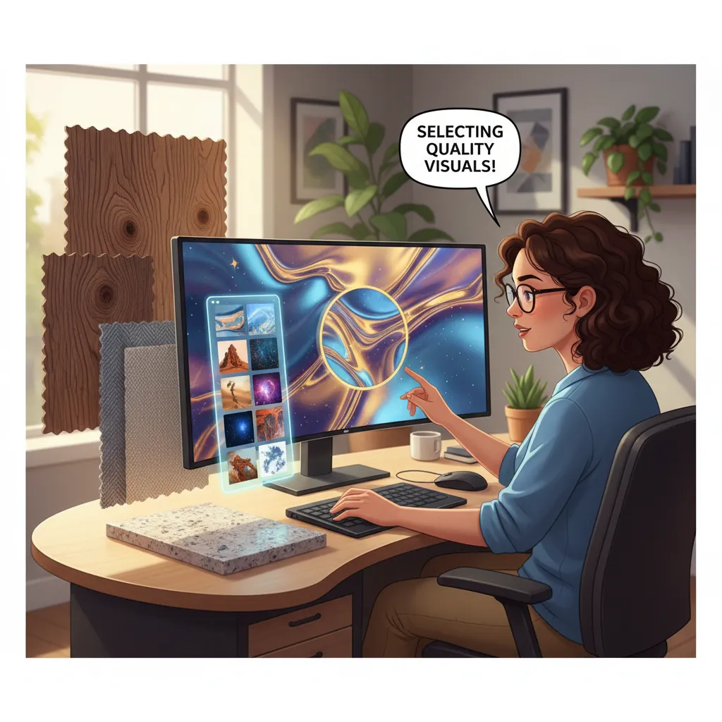
An aesthetic background often relies on imagery, but not just any image will do. You must use high-resolution visuals to prevent pixelation when your slides are projected onto a large screen. Websites like Unsplash or Pexels offer incredible, royalty-free photography that you can use as a base.
If a photograph feels too distracting, consider using subtle textures. A soft watercolor wash, a clean marble texture, or a minimalist paper grain can add incredible depth to your slides without overpowering the text. When inserting an image into the Slide Master, you can adjust the picture transparency to fade it into the background, ensuring your text remains the star of the show.
Step 3: Applying Gradients and Transparency
Solid colors are great, but gradients can add a dynamic, modern feel to your presentation. A gradient is a gradual blending from one color to another. To create a gradient background in PowerPoint, right-click your slide, select Format Background, and choose Gradient Fill.
For a truly aesthetic look, keep your gradients subtle. Blend two colors that are close to each other on the color wheel, such as a soft peach fading into a pale pink, or a deep navy transitioning to a rich charcoal. You can also play with the transparency of your gradient stops to let a subtle image peek through from behind the color wash.
Step 4: Perfecting Typography and Alignment

An aesthetic background is useless if your text looks messy. Typography plays a massive role in the overall feel of your slides. Move away from default fonts like Calibri or Times New Roman. Instead, opt for clean, modern sans-serif fonts like Montserrat, Lato, or Helvetica for your headings, paired with a highly readable serif or contrasting sans-serif for the body text.
Furthermore, flawless alignment is the hallmark of a professional deck. Use PowerPoint’s built-in alignment tools to ensure that your text boxes, icons, and background shapes line up perfectly. When elements are misaligned by even a few pixels, the audience subconsciously perceives the presentation as sloppy.
Best Tools and Resources for Slide Design
You do not have to rely solely on PowerPoint’s native tools to create beautiful backgrounds. Integrating external design resources can elevate your work significantly.
If you want ready-made inspiration, explore platforms like Slidesgo, which offers thousands of free and premium aesthetic templates spanning various themes like minimalist, vintage, and corporate. You can download these templates, study how their Slide Masters are constructed, and adapt their background elements for your own use.
For custom graphic creation, Adobe Express and Adobe Illustrator are fantastic for building bespoke vector shapes and backgrounds that you can export as high-quality PNGs and insert into PowerPoint. Additionally, utilizing the Adobe Stock add-on allows you to pull premium imagery directly into your presentation workflow.
Common Mistakes to Avoid
Even with the best intentions, it is easy to fall into design traps. Avoid these common background mistakes to keep your presentation looking sharp:
- Using Low-Contrast Colors: Placing dark gray text on a black background, or yellow text on a white background, makes your content unreadable. Always test your slides by stepping back from your monitor to ensure high contrast.
- Overcrowding the Canvas: Do not use backgrounds with busy patterns or highly detailed photographs. If you must use a complex photo, apply a heavy blur or a dark, semi-transparent overlay so the text stands out.
- Inconsistent Aesthetics: Mixing a vintage floral background on one slide with a futuristic neon background on the next confuses the audience. Pick one aesthetic and stick to it throughout the entire deck.
- Ignoring Aspect Ratios: Ensure your slide size matches the screen you will be presenting on. Stretching a 4:3 background image to fit a 16:9 slide will distort your graphics and ruin the aesthetic.
Expert Pro Tips for Presentations
If you want to take your aesthetic PowerPoint backgrounds to the elite level, consider these expert insights:
First, embrace motion graphics and subtle animations. A background does not always have to be static. Using the Morph transition between slides with slightly different gradient positions can create a smooth, cinematic experience for the viewer.
Second, utilize the eyedropper tool relentlessly. When you insert a photograph or a company logo, use the eyedropper tool to pull exact colors from that image to use in your background shapes and fonts. This creates an instantly harmonious color palette that looks incredibly bespoke.
Conclusion
Finally, design for your specific audience. A pitch deck aimed at a traditional financial institution should utilize conservative, structured backgrounds. A presentation for a boutique marketing agency can afford to use bold, asymmetrical background layouts. Tailoring your aesthetic to the room ensures your visual message resonates deeply with the people watching.
Mastering how to create aesthetic PowerPoint backgrounds elevates your entire message, building trust and engagement. By applying these design principles, you will transform ordinary slides into powerful visual assets. Ready to impress your audience? Start customizing your slide master today and watch your presentation impact soar!
FAQs
What is the best program to design presentation backgrounds?
While Microsoft PowerPoint has robust built-in tools like the Slide Master and gradient fills, many professionals design their backgrounds in Adobe Illustrator, Photoshop, or Canva. You can export these designs as high-resolution image files and import them directly into your PowerPoint Slide Master for a highly customized look.
How do I make my background image transparent in PowerPoint?
To make an image transparent, insert a standard shape (like a rectangle) that covers your slide. Right-click the shape, select Format Shape, go to Fill, and choose Picture or Texture Fill. Insert your desired image here, and then you can use the Transparency slider to fade the image, making it a subtle background.
What are the best fonts to pair with an aesthetic background?
Clean, modern sans-serif fonts are usually the best choice because they are easy to read from a distance. Fonts like Montserrat, Open Sans, Roboto, and Helvetica pair beautifully with almost any aesthetic background. Avoid overly script or decorative fonts, as they become illegible when placed over background graphics.
How does color psychology impact my presentation?
Color psychology heavily influences how your audience feels about your message. Blue inspires trust and security, green implies growth and health, and orange brings energy and enthusiasm. Selecting a background color that aligns with the emotional goal of your presentation will make your message much more impactful.
Why is white space important in slide design?
White space, or negative space, prevents your slides from looking cluttered. It gives the audience’s eyes a place to rest and helps highlight the most important information on the slide. A background that utilizes generous white space instantly looks more premium, professional, and organized.
How do I apply a background to all slides in PowerPoint at once?
Navigate to the View tab and click on Slide Master. Select the top master slide in the left-hand thumbnail pane. Any background color, image, or graphic you apply to this specific slide will automatically cascade down and apply to every single layout and slide in your presentation.
What is the rule of thirds in presentation design?
The rule of thirds is a compositional guideline where you divide your slide into a 3×3 grid. Placing your most important background elements or textual focal points along these grid lines, or at their intersections, creates a naturally balanced and visually appealing layout.
How do I ensure my background text is readable?
The key to readability is high contrast. If you have a dark background, use white or very light text. If your background is light, use dark gray or black text. If your background image is busy, place a semi-transparent colored shape directly behind your text to create a smooth, readable surface.
Where can I find high-resolution visuals for my PowerPoint slides?
You can source excellent, royalty-free, high-resolution visuals from websites like Unsplash, Pexels, and Pixabay. For premium corporate options, Adobe Stock and Shutterstock offer incredible photography and vector graphics that are perfect for professional presentation backgrounds.
Should I use animations on my slide PowerPoint backgrounds?
Subtle animations can enhance an aesthetic background, but they should be used sparingly. A gentle fade or the Morph transition can make your presentation feel fluid and modern. However, aggressive or overly complex animations will distract your audience from the core message of your presentation.


